Product screenshots for directory listings: show one useful workflow
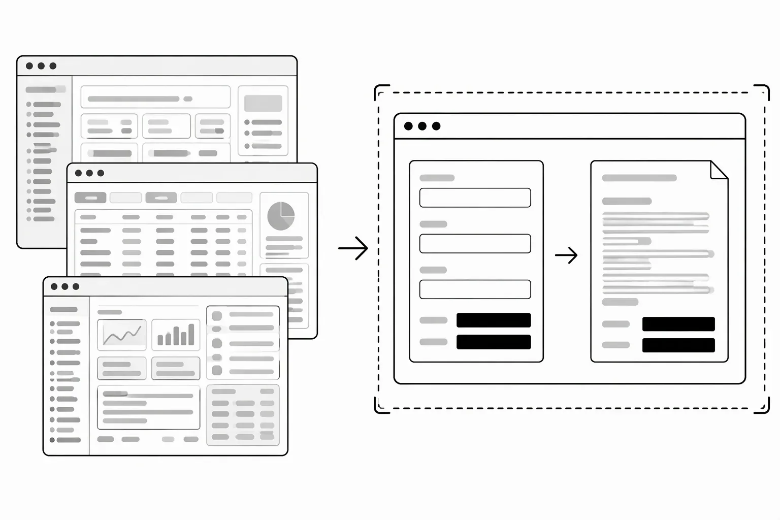
Choose product screenshots for a directory listing that show the main task your software performs and the result a user can inspect. Use a clean demo account, remove sensitive data, and crop only after checking the directory’s image requirements. One readable workflow is more useful than a collage of tiny screens.
Which product screenshot should lead the listing?
The first screenshot should answer the question created by your description: “What does this look like when I use it?” Show the core input, action or output—not merely your logo or an empty dashboard.
For a fictional release-note tool, a useful first screen would show a small set of demo pull requests beside an editable release-note draft. A screenshot of billing settings would prove the product has settings, but not explain its main job. If that main job is hard to name, draft a workflow-based product description before choosing the screen.
If the workflow cannot fit in one readable screen, use two distinct images: the starting point and the useful result. Follow the platform’s minimum and maximum image counts rather than treating this recommendation as a requirement.
Use safe demo data before taking the screenshot
Prepare the screen, then capture it:
- Create fictional records clearly intended for demonstration.
- Remove customer names, emails, messages and confidential project details.
- Check account menus, browser tabs, addresses, notifications and sidebars.
- Hide API keys, access tokens and private URLs.
- Inspect the exported image, not just the app window.
Replacing sensitive data before capture is safer than hoping a blur conceals everything. If redaction is necessary, check that the final flattened image contains only the redacted version. Don’t publish private data in the image’s filename or caption either.
Crop for understanding, not for hiding limitations
Remove unrelated browser chrome and empty margins while preserving the workflow’s context. Keep enough of the interface visible that a visitor can identify what they are seeing.
Do not combine separate states into a screenshot that implies the product performs them simultaneously. Label an annotated illustration or prototype as such; don’t present it as a live feature.
Look at the image at approximately the display size a visitor will see. If essential text becomes unreadable, show less of the interface rather than shrinking the whole application further.
Follow each directory’s current media guidance
Product Hunt’s product-page guide asks for product-in-use media and gives its own image recommendations. BetaList’s gallery guidance recommends roughly 4:3 images and warns against tiny or extreme-aspect-ratio pictures. Those are platform-specific, not universal standards.
Keep an original capture so you can make different crops without repeatedly compressing the same image. Use only materials you have rights to publish.
Don’t delay a request for optional assets
Use the startup directory submission checklist to separate required details from optional assets.
LaunchNest’s current free listing request does not require a logo or screenshot. Prioritize accurate product details and publication permission. Requests are manually reviewed, with no guaranteed acceptance, deadline or discovery outcome. If the page is unavailable, email launchnest@brainer.one.